 From looking at this, I think I will change the positioning of the artist and song name. I am also going to change the names as this is just an example I used to get an idea down. I am also considering taking photos of my performer at the shooting location of Bransgore where I have recently done a location shoot. I think the lighting there is very appropriate for the subdued feel of the track and therefore would connote the right feel for the song. Although I do really like the design of this digipack cover, I think different colours a prehaps a different image would work better.
 Thursday 27 October 2011
An idea of my digipack cover...
This is an attempt at a first idea of my digipack cover. I created it through word and paint, therefore it is a VERY basic idea!
 From looking at this, I think I will change the positioning of the artist and song name. I am also going to change the names as this is just an example I used to get an idea down. I am also considering taking photos of my performer at the shooting location of Bransgore where I have recently done a location shoot. I think the lighting there is very appropriate for the subdued feel of the track and therefore would connote the right feel for the song. Although I do really like the design of this digipack cover, I think different colours a prehaps a different image would work better.
From looking at this, I think I will change the positioning of the artist and song name. I am also going to change the names as this is just an example I used to get an idea down. I am also considering taking photos of my performer at the shooting location of Bransgore where I have recently done a location shoot. I think the lighting there is very appropriate for the subdued feel of the track and therefore would connote the right feel for the song. Although I do really like the design of this digipack cover, I think different colours a prehaps a different image would work better. Location Shoot
I live in Bransgore which is a small village and is relatively quiet. I went down to the shops where there are street lights and took a few photos just to get a feel of the location and to decide whether I will use it in my video. It will work for the shots when my character walks along looking down at the floor and other shots such as lip synching whilst walking along. However I may need to consider another location which is busier at night so I can have more of an atmosphere and my character can act like he does not fit in and portray anxious, worried emotions.


Research into The Script
From realizing that The Script have produced a similar music video to what I'm going for, I decided to look into their CD covers and any posters they have for inspiration for my ancillary task.
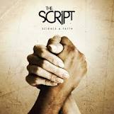


Above are a selection of the CD covers from The Script. These are a good example of what I will be doing for my digipack. The facial expressions of the band match what my character will look like. These expressions show maturity opposed to a band singing parody songs etc. You can tell from the cover of these albums that the songs may be emotional and include the genre of 'soul'. The colours help connote this, especially the top-left and bottom-right CD covers. They are sinister and gentle colours opposed to bright, loud colours that may portray up beat songs.


Above are a selection of the CD covers from The Script. These are a good example of what I will be doing for my digipack. The facial expressions of the band match what my character will look like. These expressions show maturity opposed to a band singing parody songs etc. You can tell from the cover of these albums that the songs may be emotional and include the genre of 'soul'. The colours help connote this, especially the top-left and bottom-right CD covers. They are sinister and gentle colours opposed to bright, loud colours that may portray up beat songs.
I also noticed from these covers that the main singer has the 'star image'. He is the biggest person on the cover and is also at the front to show he is the face of the band. I will be using this method on my digipack- a close-up of Ed (my actor) will help to secure his face to his music which will then help to attract the target audience.


The posters share the same characteristics of the 'star image' effect as the CD covers. Black and white is an effect I am very keen on using due the mellow mood created by the track I am making the video to.
Tuesday 25 October 2011
Photo Shoot
I did a photo shoot of Ed, my actor in the clothes that I intend on filming him in. The purpose of this was to create the look of the character and to get some photos together to enable me to begin adding effects and editing them for ideas for the digipack. The photo shoot went really well and I took a range of photos from different angles. Ed pulled facial expressions to show a 'sad', 'mellow' mood to fit with the feel of the track. I used black and white effects to enhance this mood more as the plain, dull colours contribute to the same mellowness of the track.


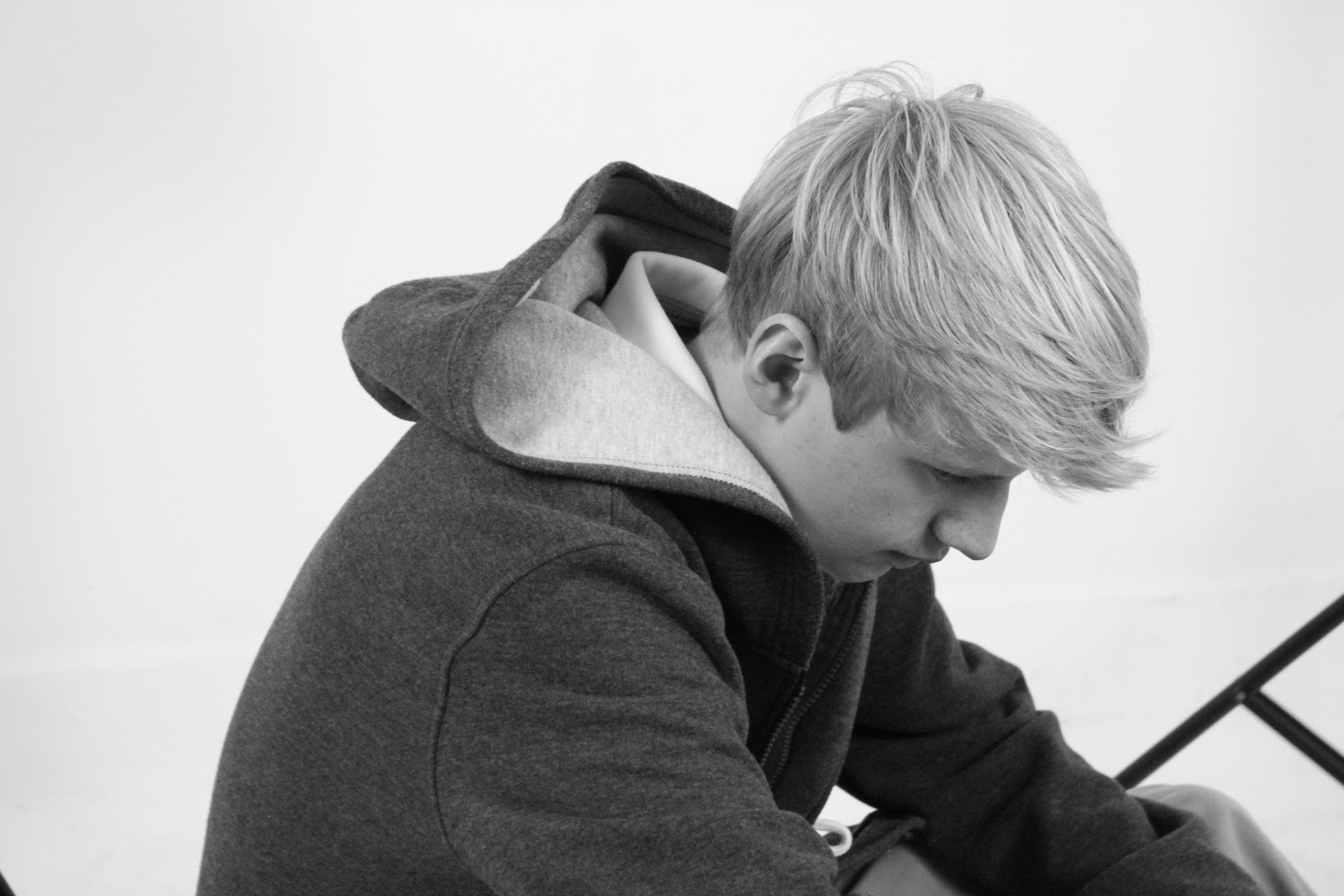
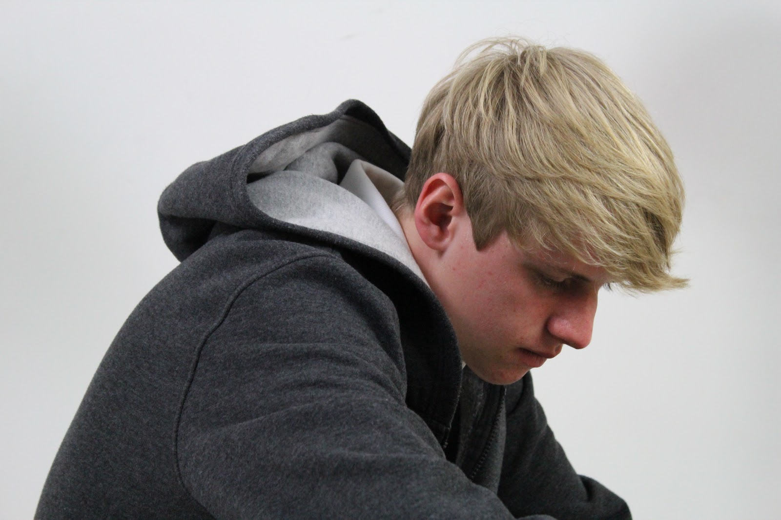


These are a selection of photos from the photo shoot. Some are edited and others I have left as I took them. The black and white photos have not been edited, I took them with the black and white mode on the camera which is really useful when I come to filming the black and white shots.
Inspiration
I have been thinking about what I want my music video to look like. Here is some inspiration.
The low angle shots of his feet are what I would like to include in my music video. They connote sadness and 'low' moods which is ideal for the track I am doing my music video to.
The facial close ups are also relevant to what I want to include in my video as they show expressions and emotions. This will help to show the feelings of the character which are delivered through the song.
One of the differences that there is between the ideas of my music video and this one is the lip syncing. I do not plan on having the character in my music video lip syncing the whole way through as I feel it creates more of a mellow mood.
Slow head movement and looking down on the ground, (shown by low-angle close ups) is what the main focus of my music video will be. I will use many shots to show the emotions of my character as the song is very emotionally focussed.
I am undecided..but I may include some performance shots. This would include Ed (the main character) singing in to a microphone with dark lighting in a plain room (maybe one of the studios at school)
From looking at this video, I have noticed that to make it look professional, I need a wide variety of shots and I need to edit them together so there is a constant change to keep the viewer intrigued.
Thursday 20 October 2011
Background Research - Arctic Monkeys
Arctic Monkeys are an English indie rock band. I wanted to look at some posters and digipack covers by a band of this genre to get some inspiration on fonts, layout and graphical features.


Here are four examples of the posters from the Arctic Monkeys.I like the one on the top-right. It is very 'indie' and individual. However, the other three are very 'comic' like. The fonts are similar to each other which carries continuity. However, the bottom left poster had bold, plain font. This is what most appeals to me for my poster, I do not plan on using any funky font as it would not sell my track correctly.


Above are some album covers for the Arctic Monkeys. The top two relate to my ideas with the black and white effect. I really want to include this in either my poster (possibly both) as I think it really relates to the mood given from the song. There are no colourful moods represented in the song, it is very emotional-but depressing which I think is what black and white is good at connoting if used correctly.
The fonts here are similar to those on the posters which I should keep in mind as I may need to use the same fonts for continuity purposes!
Font Research
Here is some font research for my Ancillary Tasks. It is important that I use an appropriate font as it contributes hugely to the vibe given.
 I used 'Eyes Closed' to show the fonts as this is the Album name that I most like at the moment.

Wednesday 19 October 2011
Name Deciding

I listened to my track repeatedly in order to think of the names I have come up with here. This helped me to catch the mood of the song and feed ideas into my head. I wrote down everything that came to mind that I thought was relevant. I will narrow down on these names when I progress through the course a bit more. I think photographing Ed and capturing the mood will help me to grasp a final decision.
I used amazon to look at album names of James Morrison, Matt Cardle and Coldplay as these albums display similar digipack designs to what I have in mind. From this, I came up with a couple of ideas, one of which being "Eyes closed" which came from "Eyes open" by Snow Patrol.
Friday 14 October 2011
My Actor
So after the big worry of trying to find a suitable actor, I have finally found one!
Ed Tindall is a student at the same sixth form as me and is studying performing arts. He is a Drama routed student which is great as he has the confidence and skills to act exactly how I need him to for my music video. I have known his for a long time which is a bonus as it will be easy to communicate and get things done quick and easy!
As well as being great for confidence, Ed also has the perfect look for my video. He has the causal look that I am going for and pulls off the 'smart/casual' look well.


These are a few photos of Ed just to set the scene. They demonstrate the casual look that I am going for in my video. From knowing Ed for so long, I know that he is capable of acting the vulnerable character that I need for my music video. The black and white is great because it demonstrates the colours that will be included in the final product.
I intend on doing a photo shoot in one of the studios in school where I will experiment with lighting and compare what colours look best. I will then use one of these for the front cover of my digipack. The middle 'natural' look photo here is what I have in mind for the photos in my digipack as I think it delivers the genre of the song well.
Thursday 13 October 2011
Mise en scène - Costume
I want the character in my music video to wear casual clothing. The latest fashion is indie which is good for me because it is nice and easy to get hold of appropriate clothing. Chinos with a casual shirt or t-shirt is the route im going down. I have to consider what the weather conditions will be as at this time of year it can be very cold! It is not essential to have a specific outfit so I can be flexible as to what my character wears. However, I want him to look slightly vulnerable and insecure, therefore jeans with a baseball cap etc would not work!
I had a look through Topman to see what clothing is out and too see what is available for me to use. This means that if my actor does not have the clothes that are necessary, I have the option of taking a trip here and buying the clothes needed.


 I have an image in my head of how the character will look. These black coats are what I imagine him wearing, walking along with his hands in his pockets, showing vulnerability. I would prefer the jacket not to have a hood as that shows youth and I don't feel this would fit the song.


 These chinos are what I have in mind along with a coat like the ones above. I think they will denote a casual look.


 Along with the clothing above, I thought a plain white t-shirt would work well. This keeps the look simple and casual and does not demonstrate a particular fashion.


 These shoes will go nicely with the chinos and are also very casual. This fits nicely with the look I want my character to have.
I had a look through Topman to see what clothing is out and too see what is available for me to use. This means that if my actor does not have the clothes that are necessary, I have the option of taking a trip here and buying the clothes needed.
I have an image in my head of how the character will look. These black coats are what I imagine him wearing, walking along with his hands in his pockets, showing vulnerability. I would prefer the jacket not to have a hood as that shows youth and I don't feel this would fit the song.These chinos are what I have in mind along with a coat like the ones above. I think they will denote a casual look. Along with the clothing above, I thought a plain white t-shirt would work well. This keeps the look simple and casual and does not demonstrate a particular fashion.These shoes will go nicely with the chinos and are also very casual. This fits nicely with the look I want my character to have.
Subscribe to:
Posts (Atom)